DESIGN DIRECTION & ILLUSTRATION COMMISSIONStyle Relaunch
The Washington Post relaunched its iconic Style section, introducing readers to commentary, analysis, and profiles that reshape thinking around culture and style.
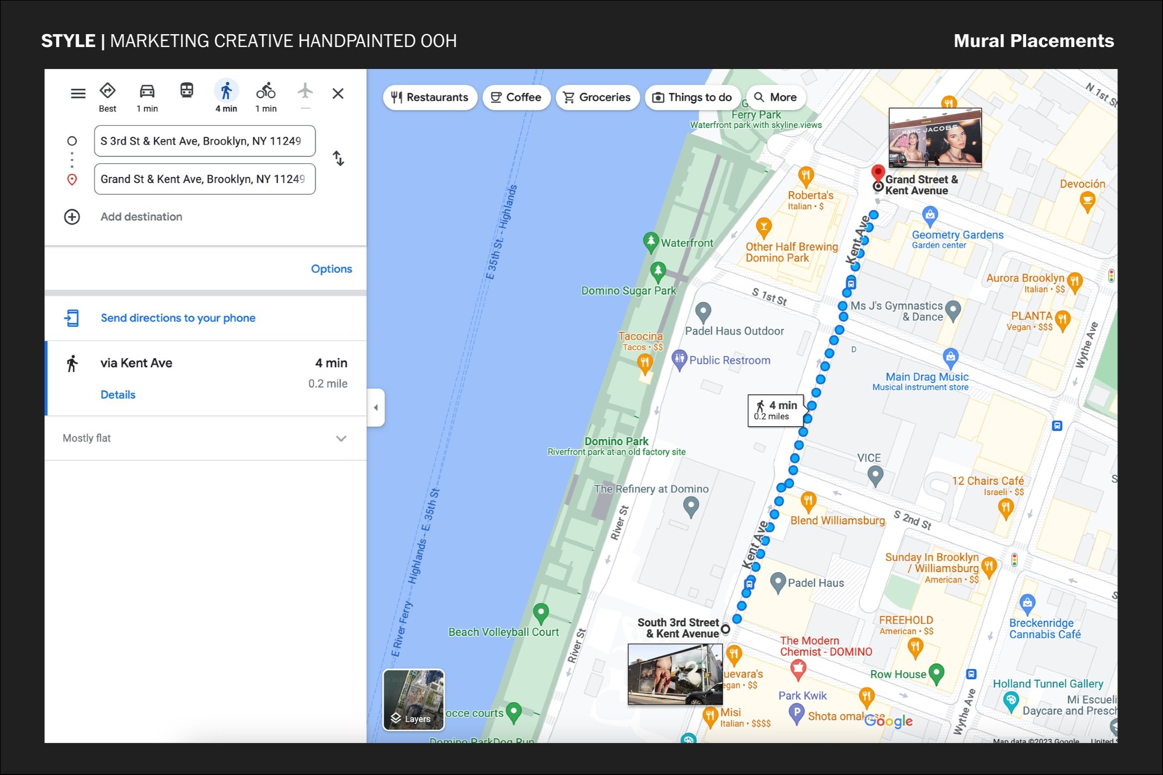
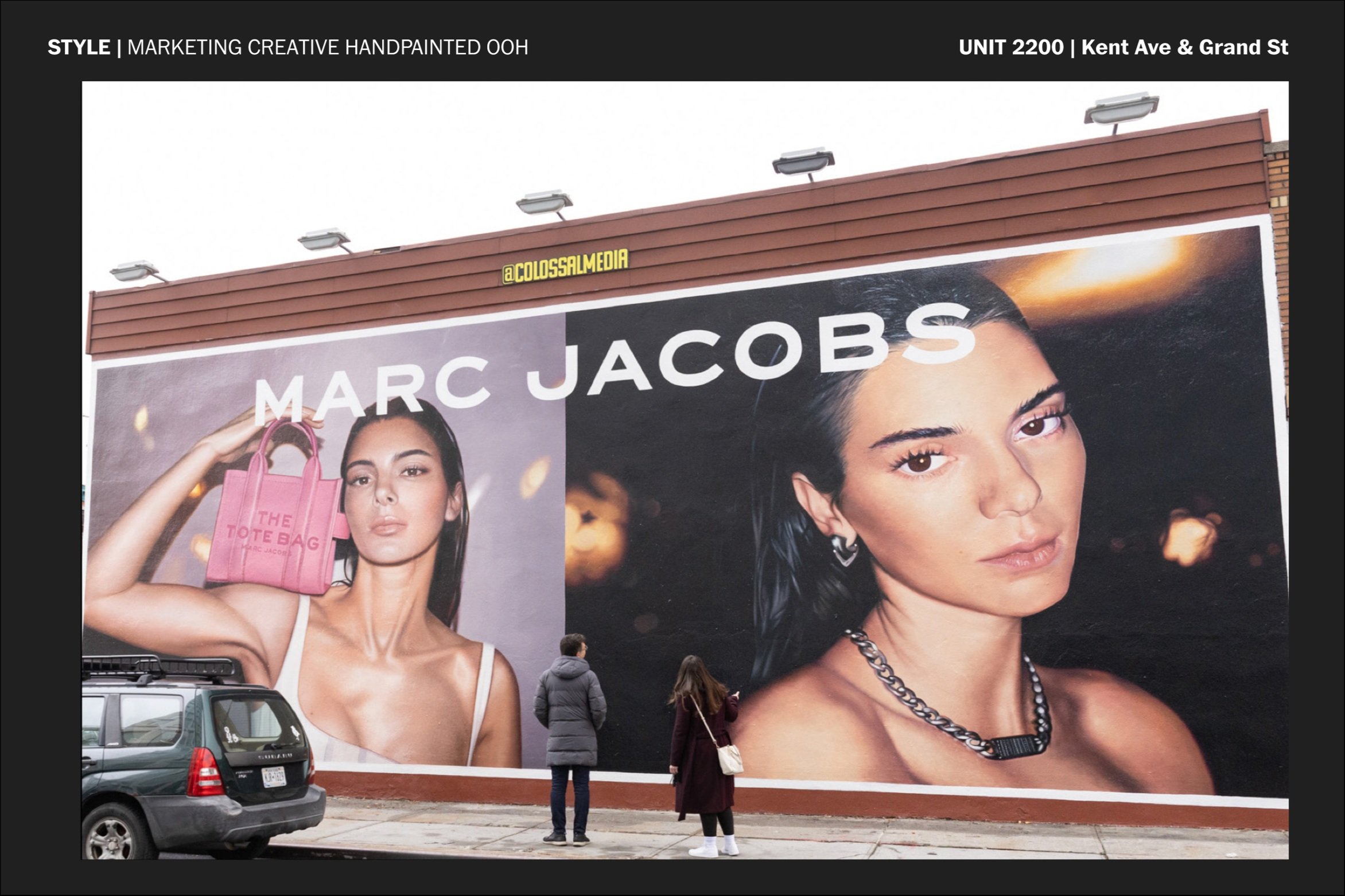
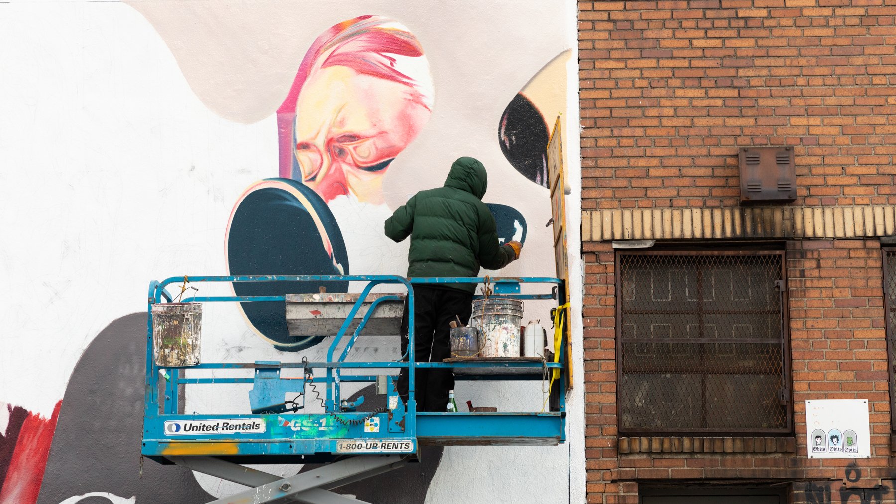
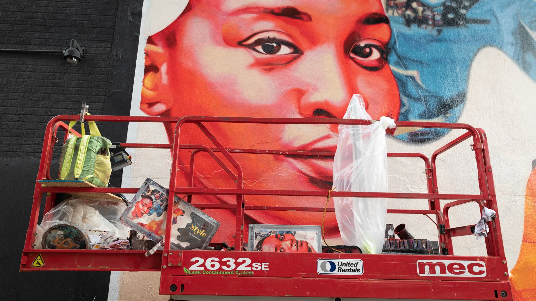
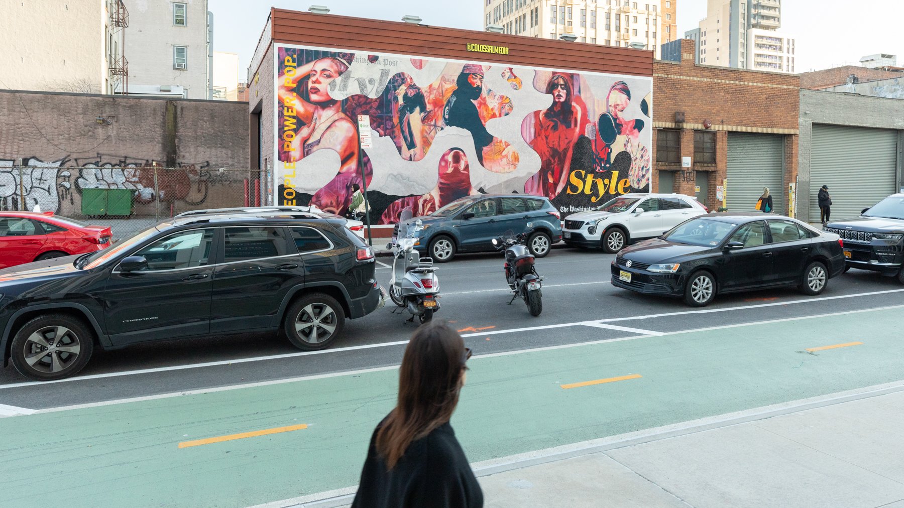
For this tentpole campaign, The Post teamed up with Colossal Media securing two mural placements in Brooklyn, NY. I was responsible for the start to finish process of researching and commissioning an illustrator, art directing, and post-producing this campaign.
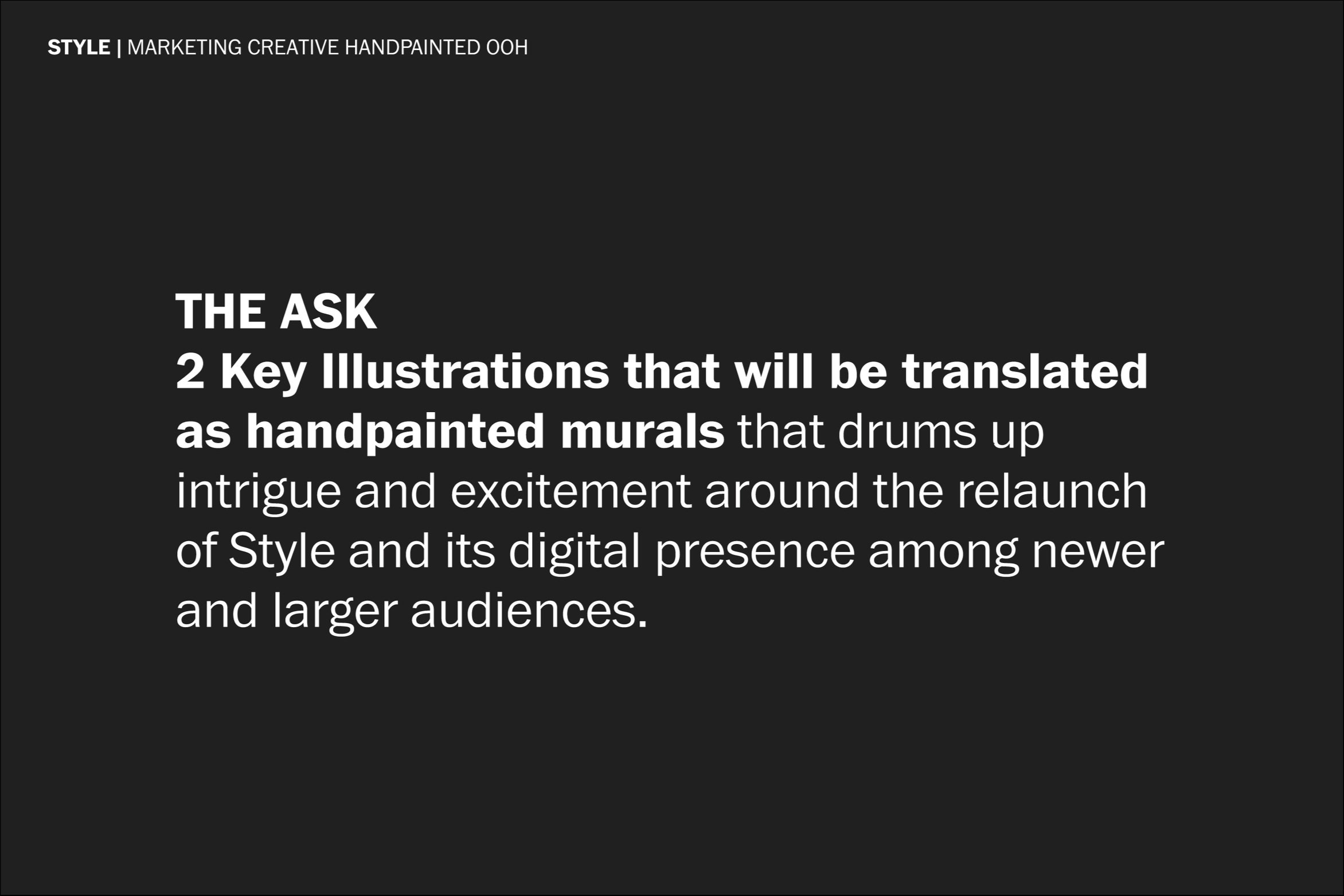
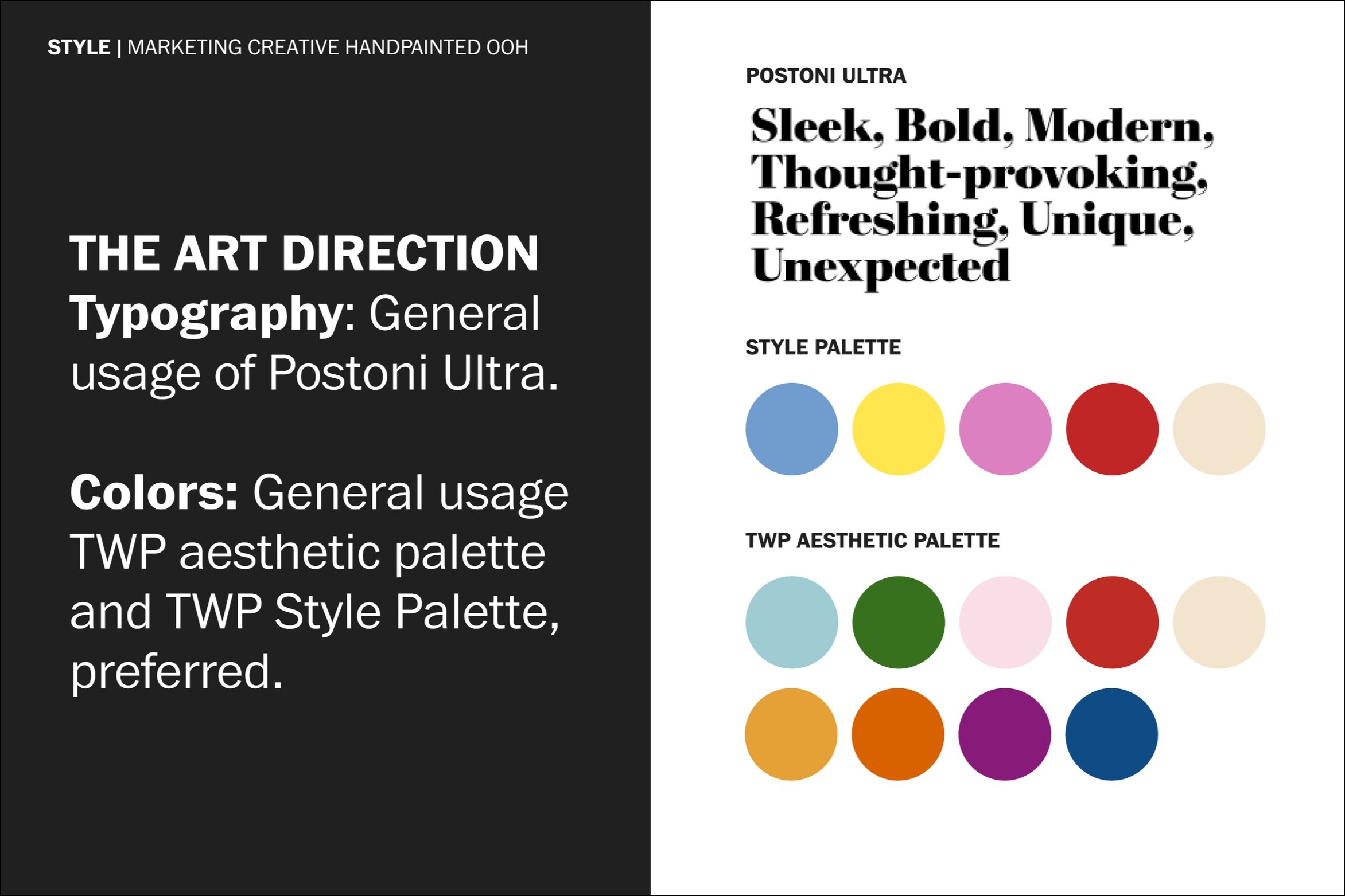
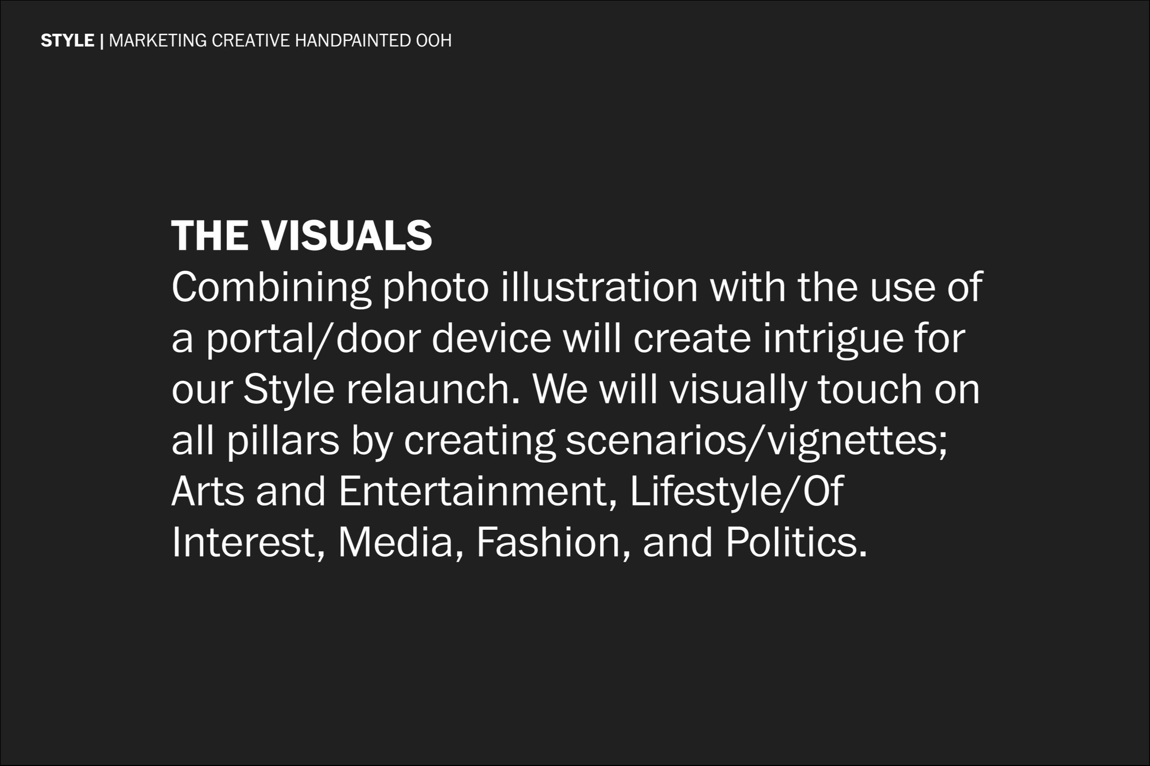
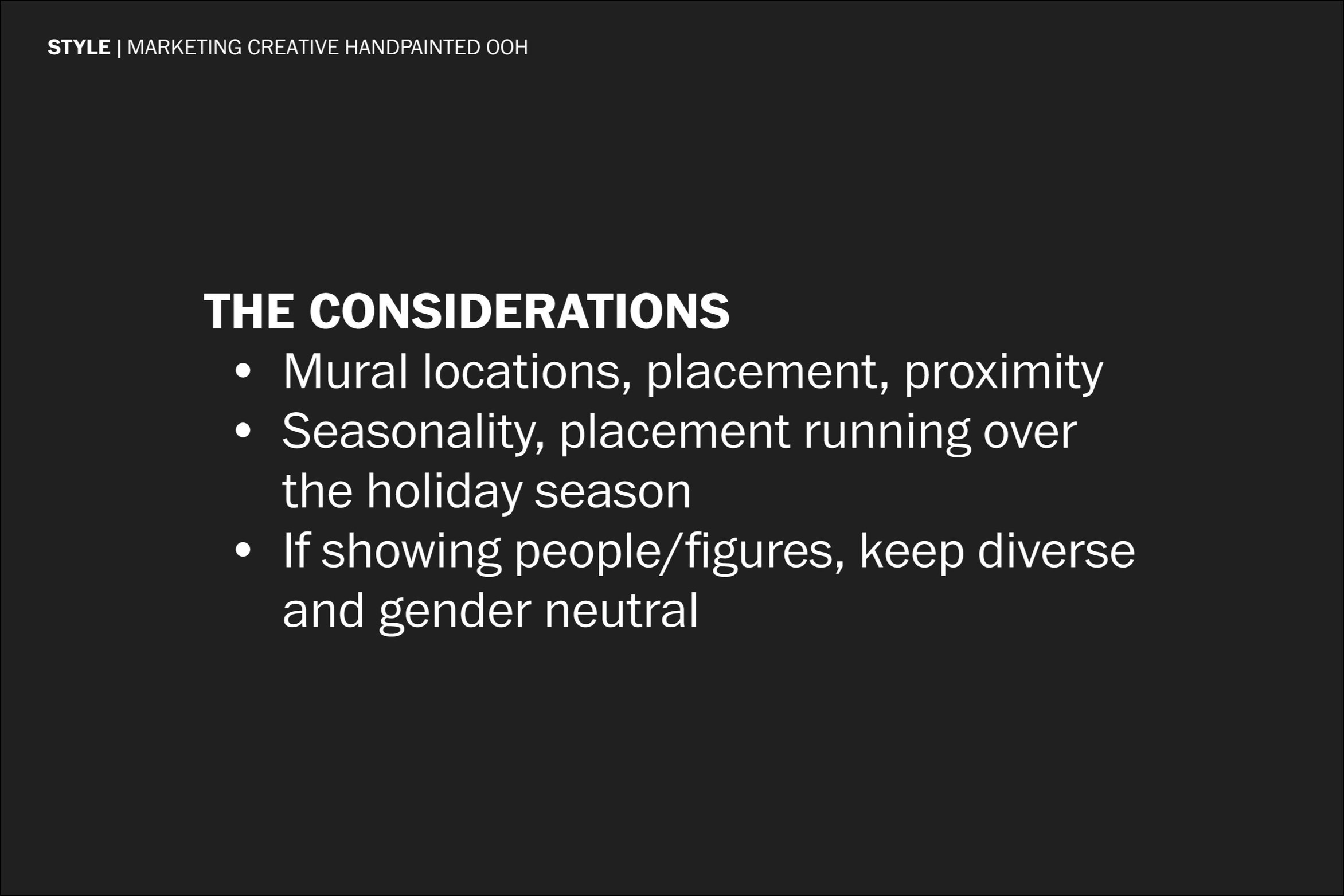
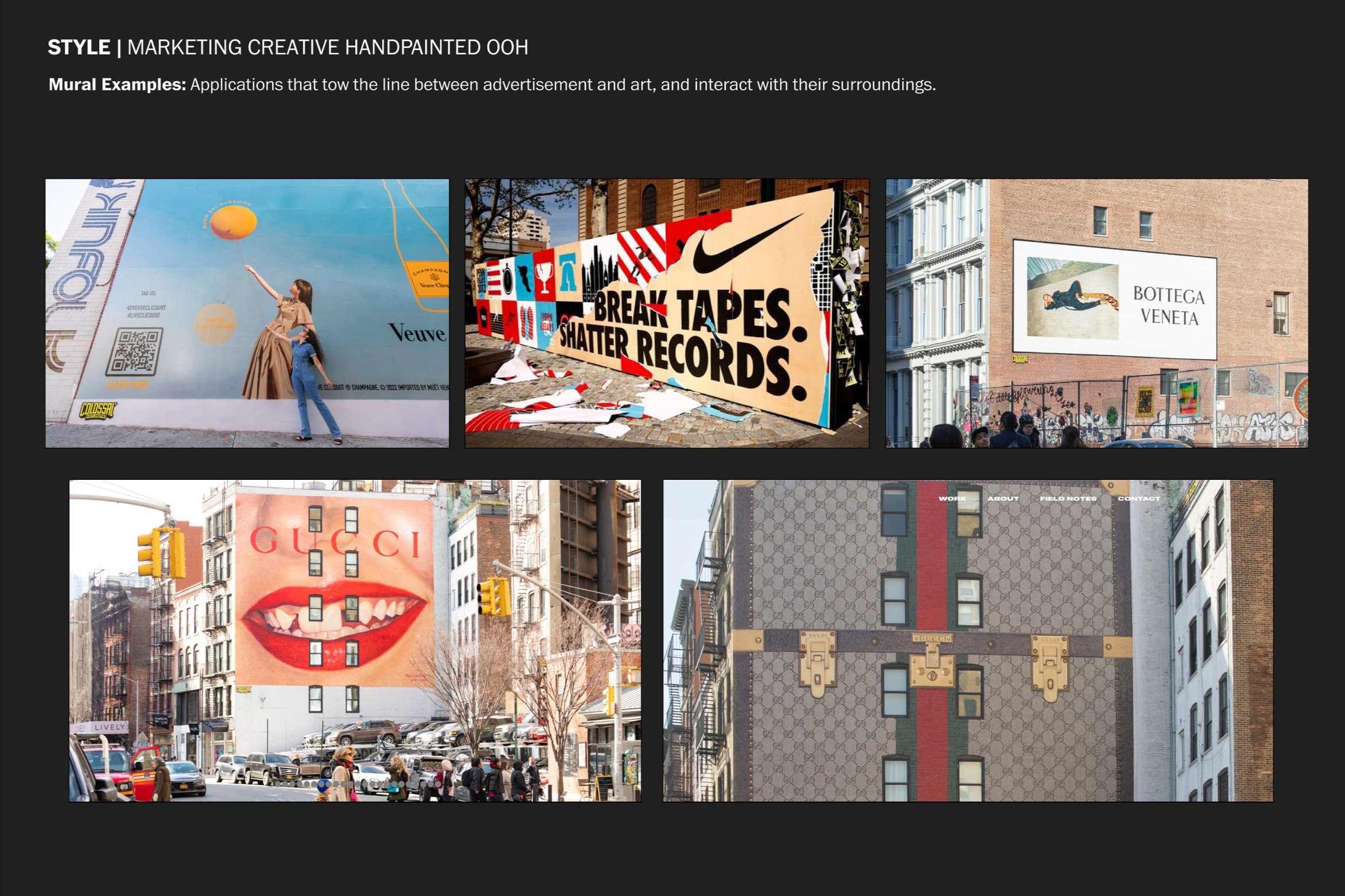
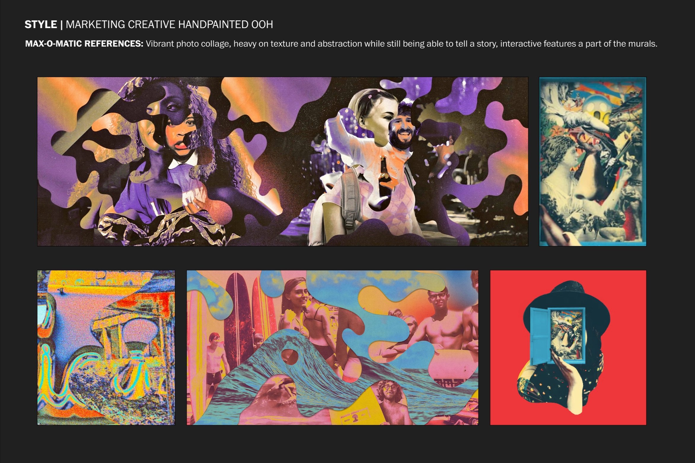
We aligned on photo-collage illustrator Max-o-matic because of his attention to detail and variety across styles, visual storytelling through layers, print motifs, and mix of color. Below are excerpts from the deck I used to brief in Max and his agency, Snyder.

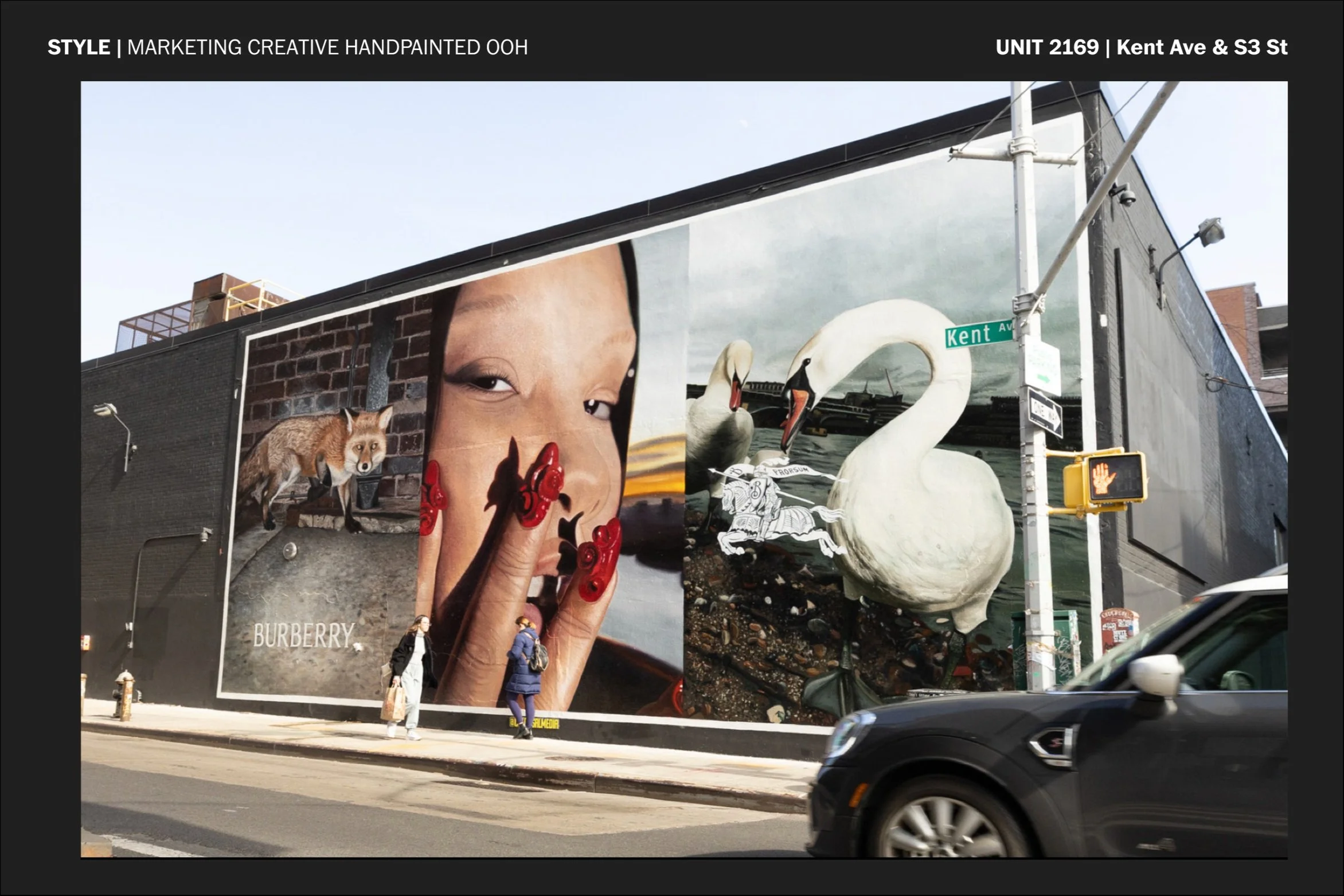
The “Making Of“
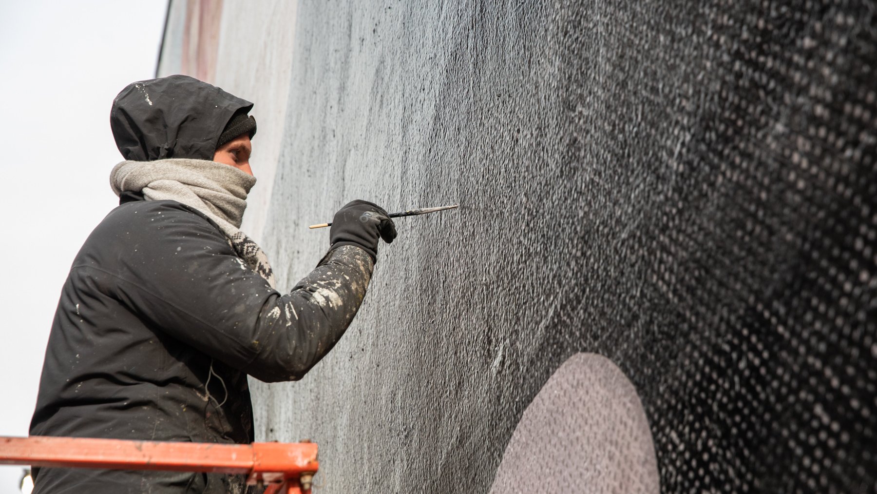
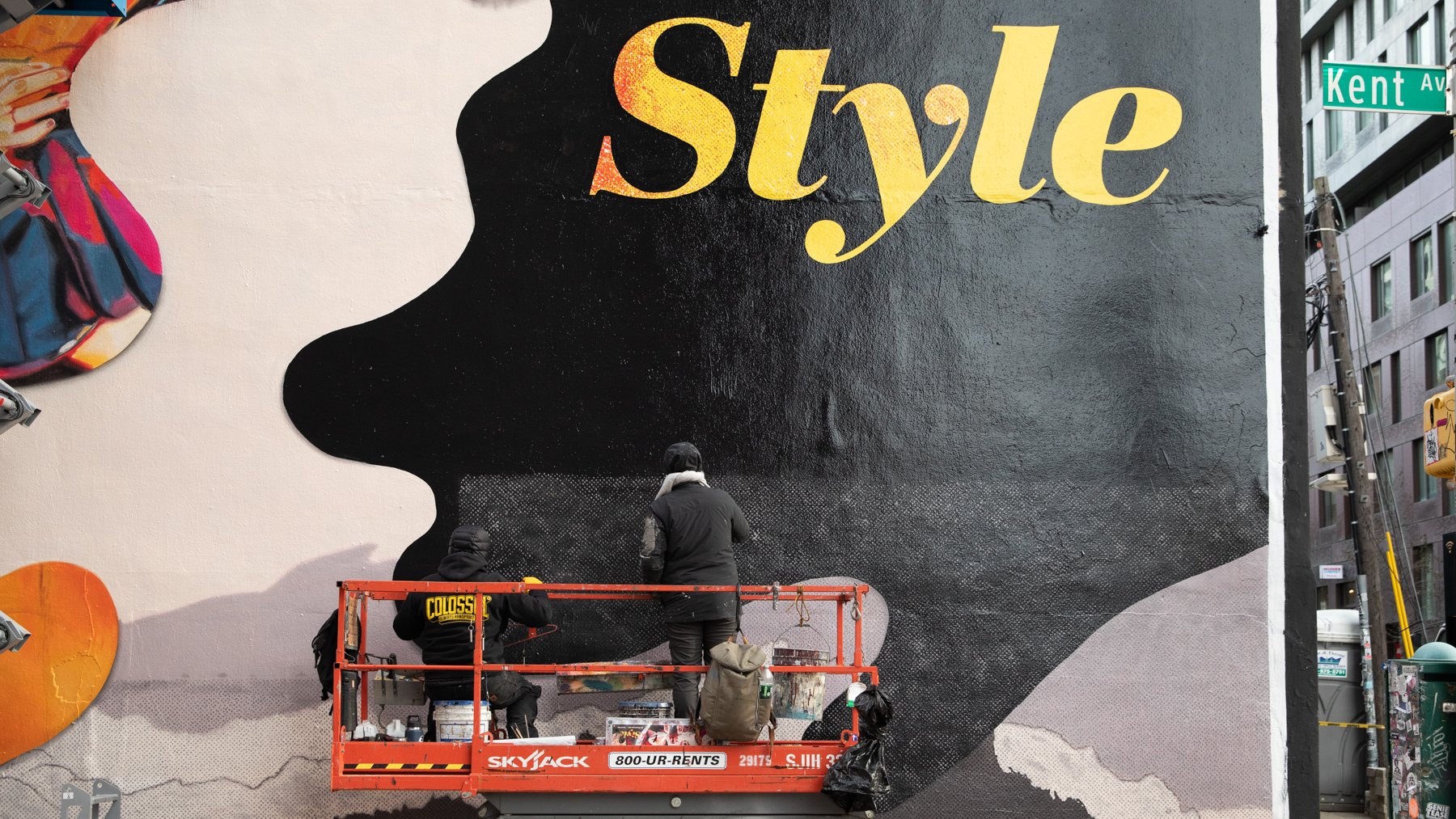
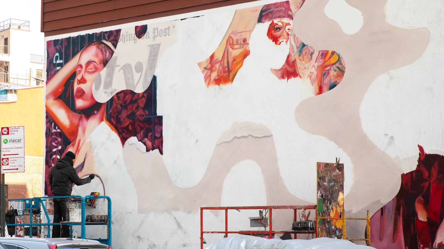
After handing off final artwork to the mural artists, I pivoted to art directing the “Making Of” video for promotion on social channels. My biggest challenge here was balancing the murals themselves and telling the story of Style at The Washington Post.
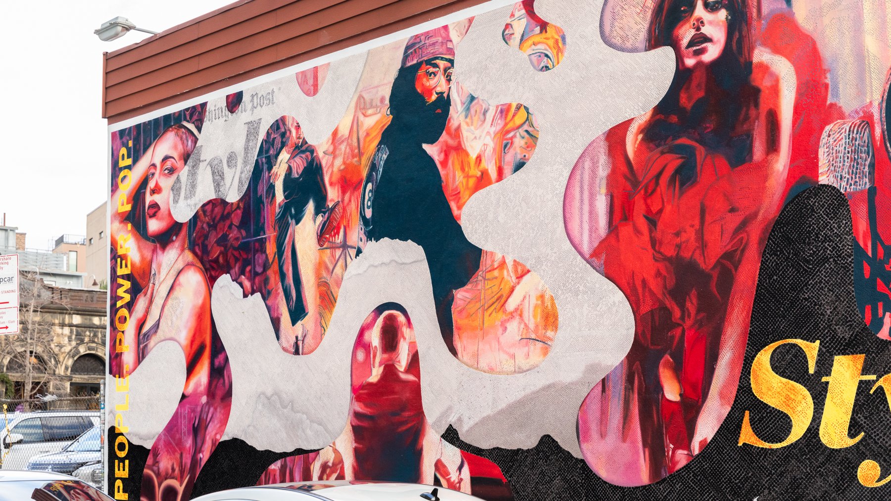
The placement of the Style murals in what is widely considered the nation’s style capital, by a news organization headquartered in the nation’s capital, exemplifies The Post’s unique approach to Style. The bespoke collage artwork represents our Style coverage by embodying the campaign language “People. Power. Pop.”
Featured vignettes spotlight this nuanced approach evoking the essence of Style; confident portraiture asserts power alongside images of protesters and politicians, while dancers and artists of all kind give a new holistic meaning to pop culture. At its core, Style is about people. Meanwhile, the textures and newsprint motifs support the collage composition while also paying homage to the Style section’s print heritage.







Design Director: Tova Diamond
Copy Director: Sheila Hayes
Artwork: Max-o-matic | Agency: Snyder
Media Partners: Colossal Media
Photography: Colossal Media
Video: Colossal Media

